
openAI published a working paper on how people use chatGPT. They include a visualisation that triggered my curiosity.
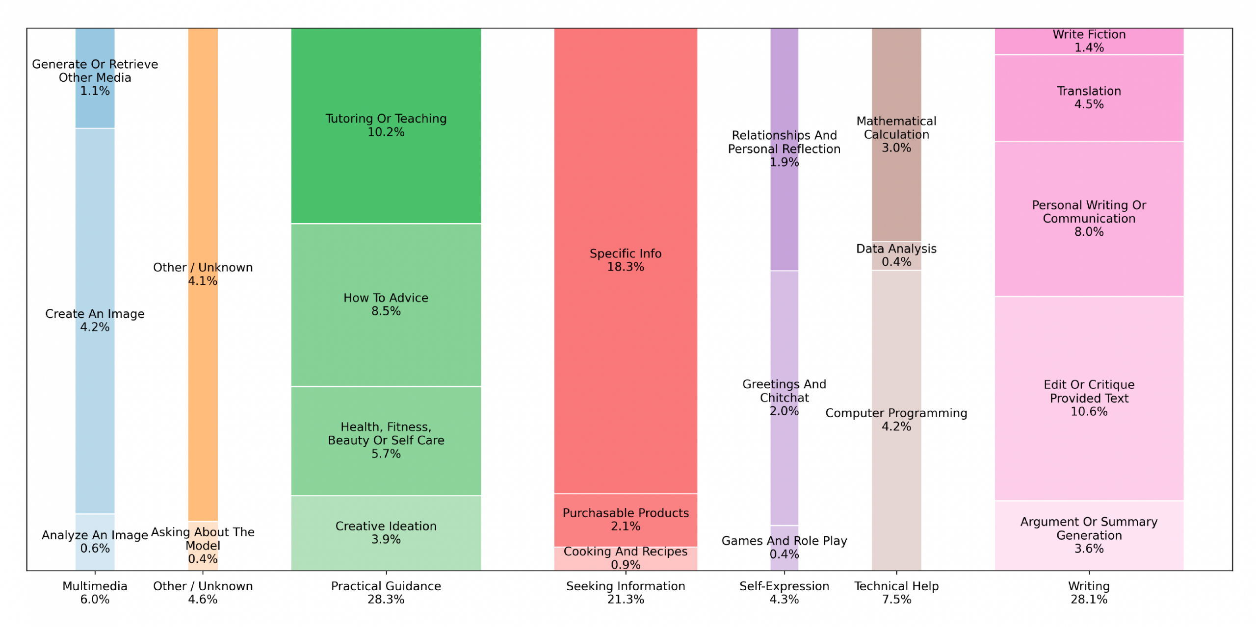
The width of the columns represents the cumulative proportion of the main category, and the height of each sub-category represents the proportion of the sub-category within the main category.
The first problem is that the percentages of the main categories do not add up to 100.
| Main Category | Percentage |
|---|---|
| Multimedia | 6.00 |
| Other / Unknown | 4.60 |
| Practical Guidance | 28.30 |
| Seeking Information | 21.30 |
| Self-Expression | 4.30 |
| Technical Help | 7.50 |
| Writing | 28.10 |
| Grand Total | 100.10 |
The percentages of the sub-categories, however, do add up to 100. Next, I measured the width of the columns to test if they actually got it right.
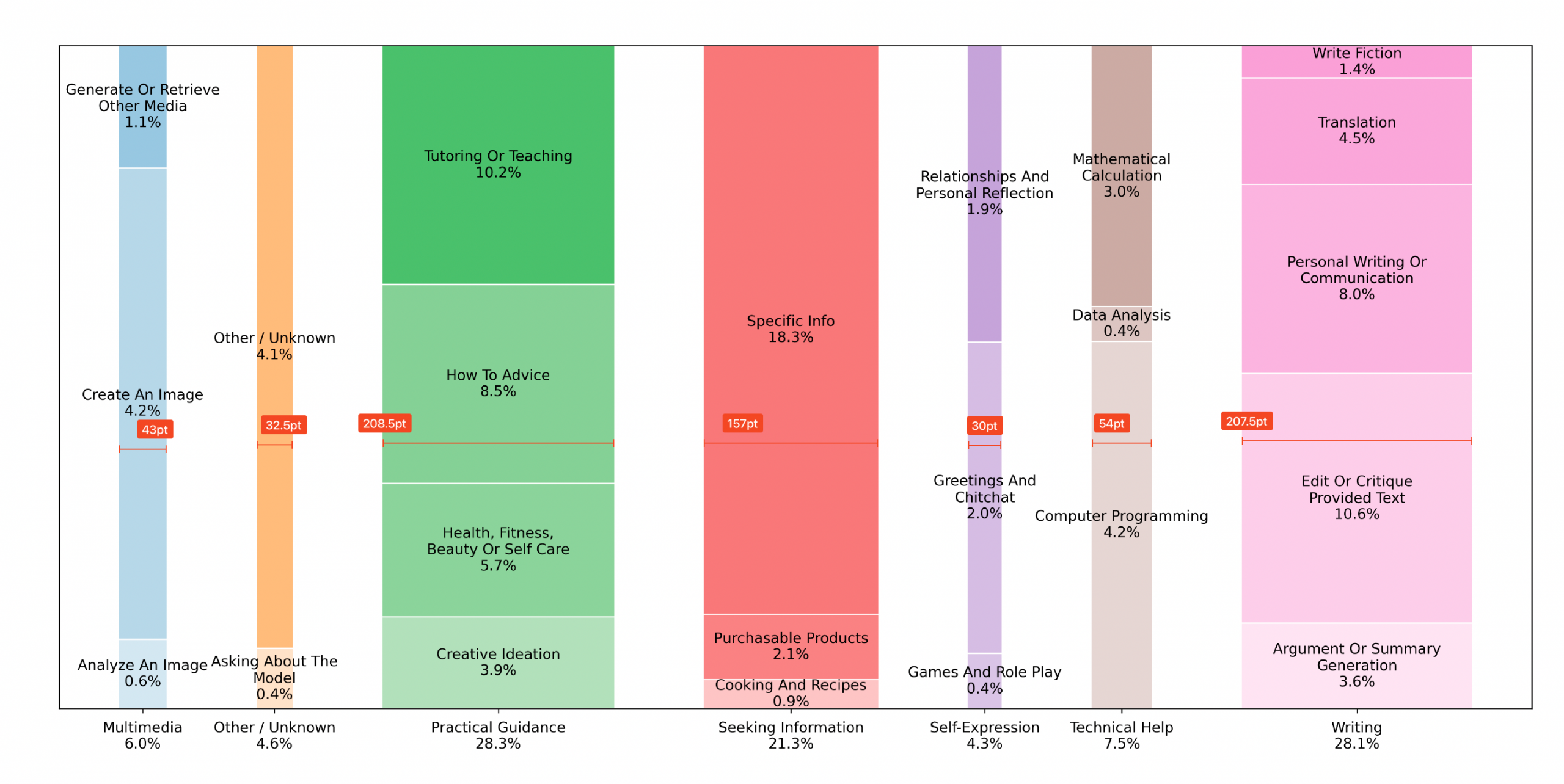
I then (ironically) used chatGPT to extract the numerical values from the graph.
Next, I divided the width of the column by the percentage it is supposed to represent.
| Main Category | Calculated Percentage | Column Width | Column Width Ratio |
|---|---|---|---|
| Multimedia | 5.9 | 43.0 | 7.3 |
| Other / Unknown | 4.5 | 32.5 | 7.2 |
| Practical Guidance | 28.3 | 208.5 | 7.4 |
| Seeking Information | 21.3 | 157.0 | 7.4 |
| Self-Expression | 4.3 | 30.0 | 7.0 |
| Technical Help | 7.6 | 54.0 | 7.1 |
| Writing | 28.1 | 207.5 | 7.4 |
While the columns approximate the main category percentages, they vary considerably. So, how can we do this better? The answer is a good old area graph. It scales each box according the the percentage and groups them into the main categories by color.
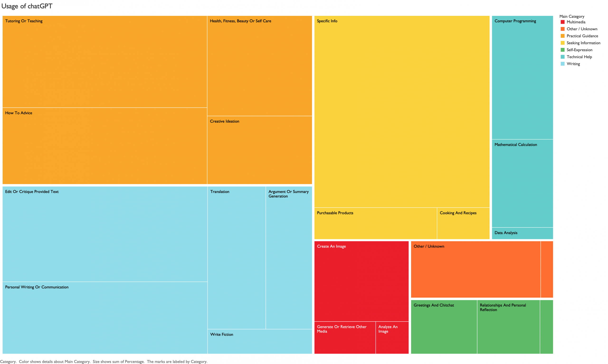
A new type of visualization is not always a better visualization.