Another Friday art attempt.
yy01Author: Christoph Bartneck
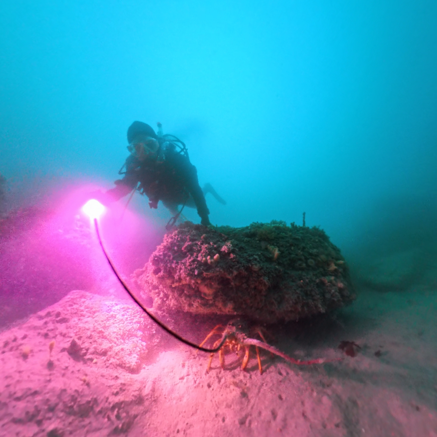
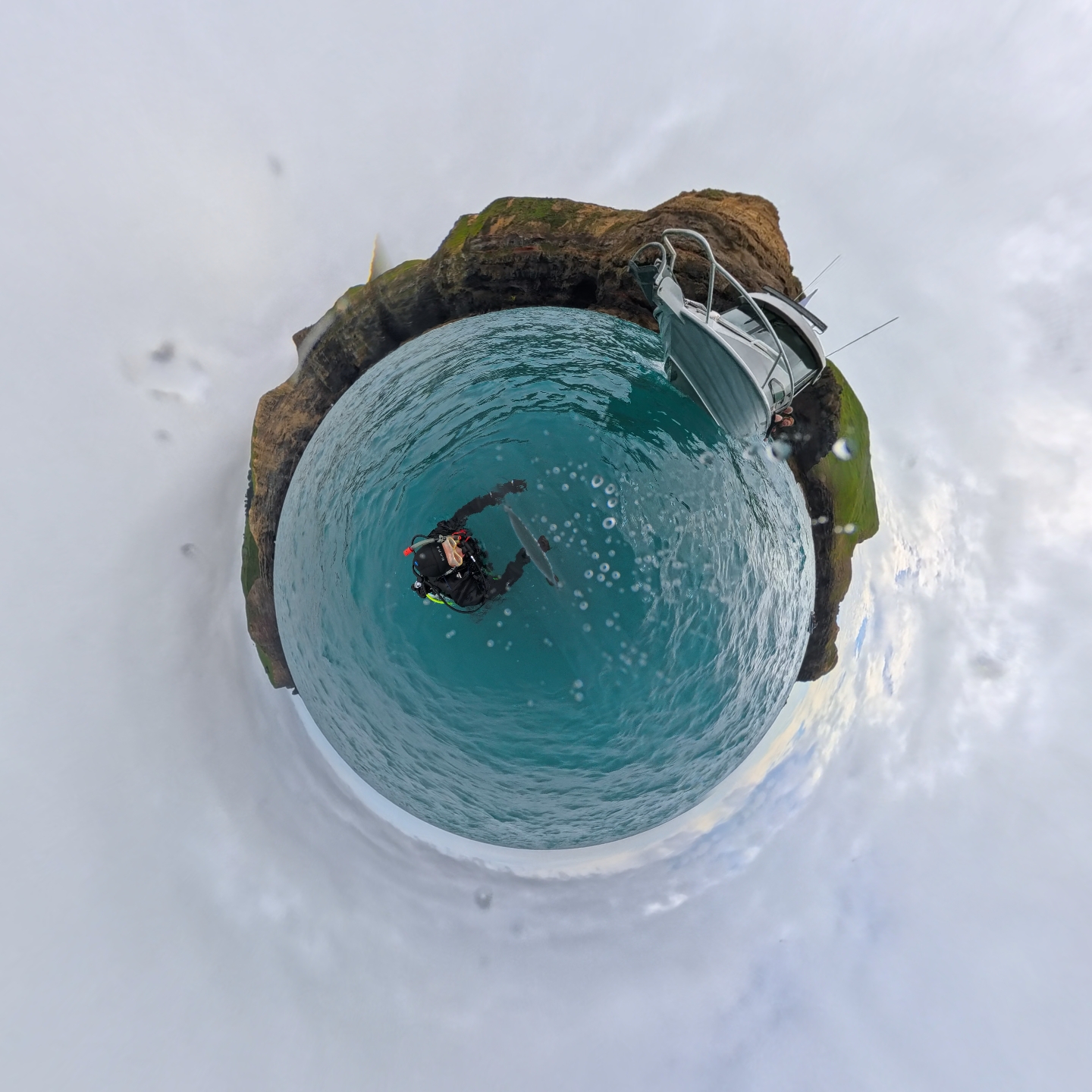
Scuba Diving at the Poor Knights Islands
We visited the Poor Knights Marine Reserve in New Zealand for some scuba diving. It was marvellous.
Friday Art
Just because it is Friday, it is time for a little bit of art. Today I created a Moiré pattern with Patternodes.
moire01Keynote talk at OMG2025
I gave a keynote talk at the Oceania Maths Gathering 2025 about Information is beautiful.
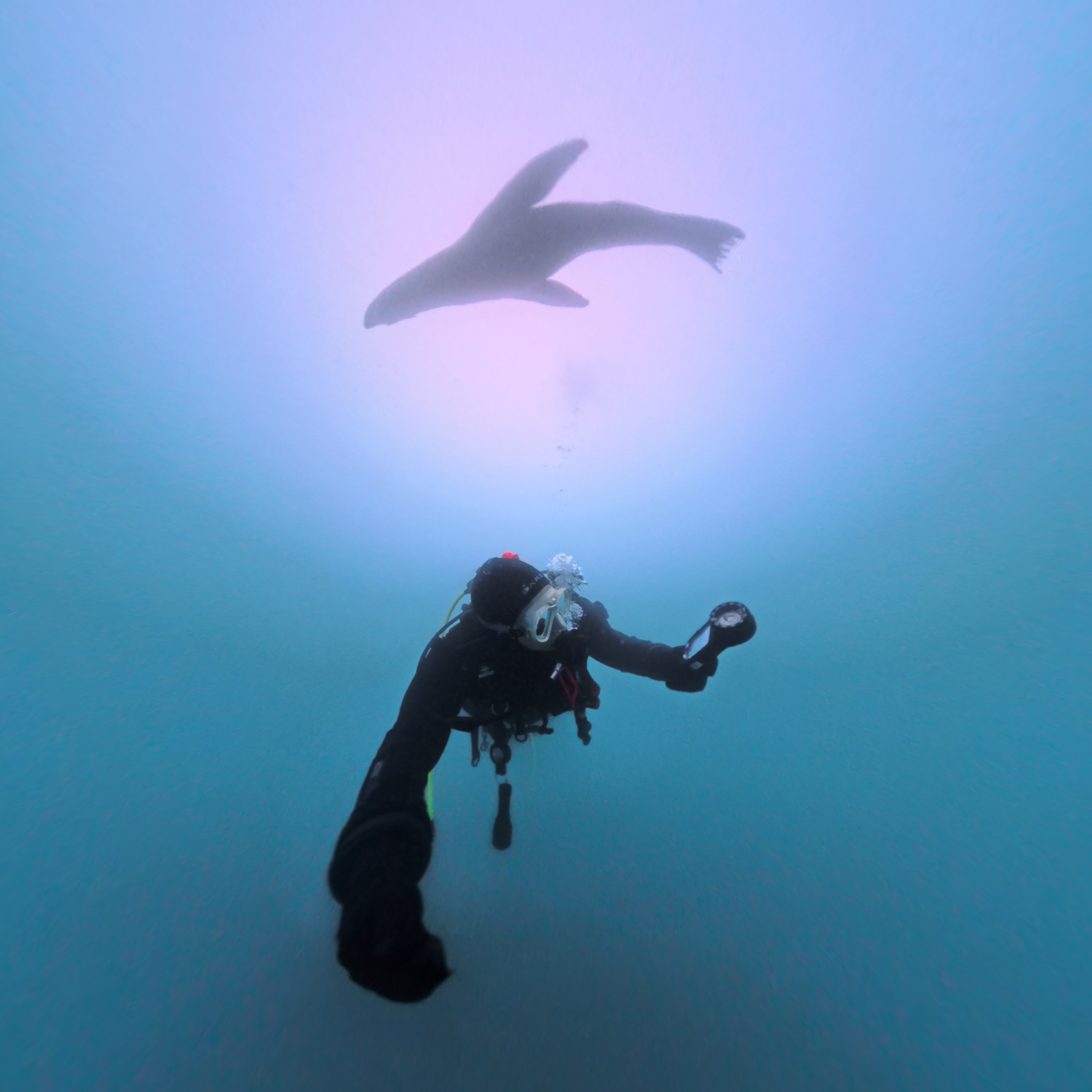
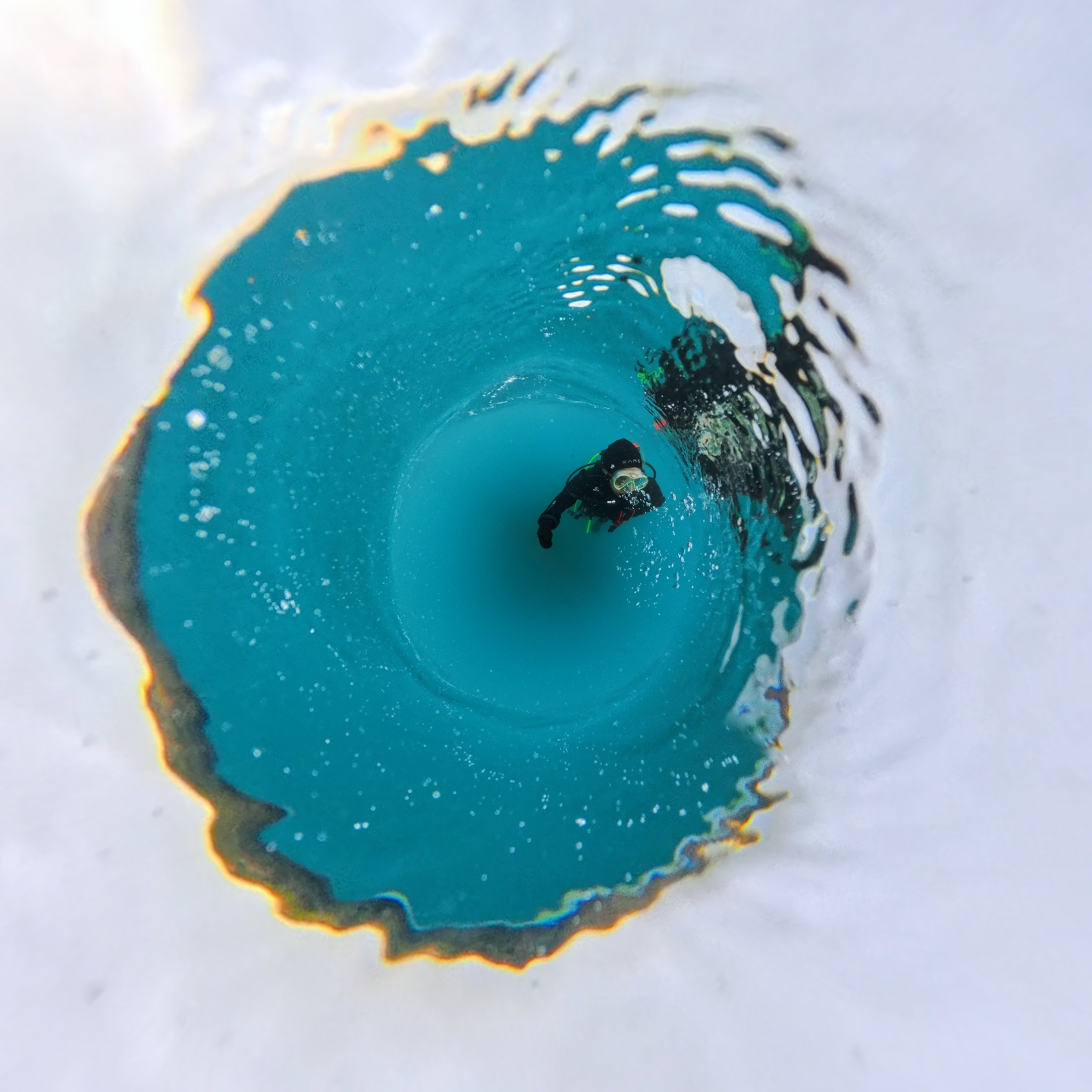
Diving in Akaroa
I went diving with the North Canterbury Dive Club and I a seal photo bombed me. What a fantastic out on the water.