
Just because it is Friday, it is time for a little bit of art. Today I created a Moiré pattern with Patternodes.
moire01Category: Design
chatGPT visualisation
openAI published a working paper on how people use chatGPT. They include a visualisation that triggered my curiosity.
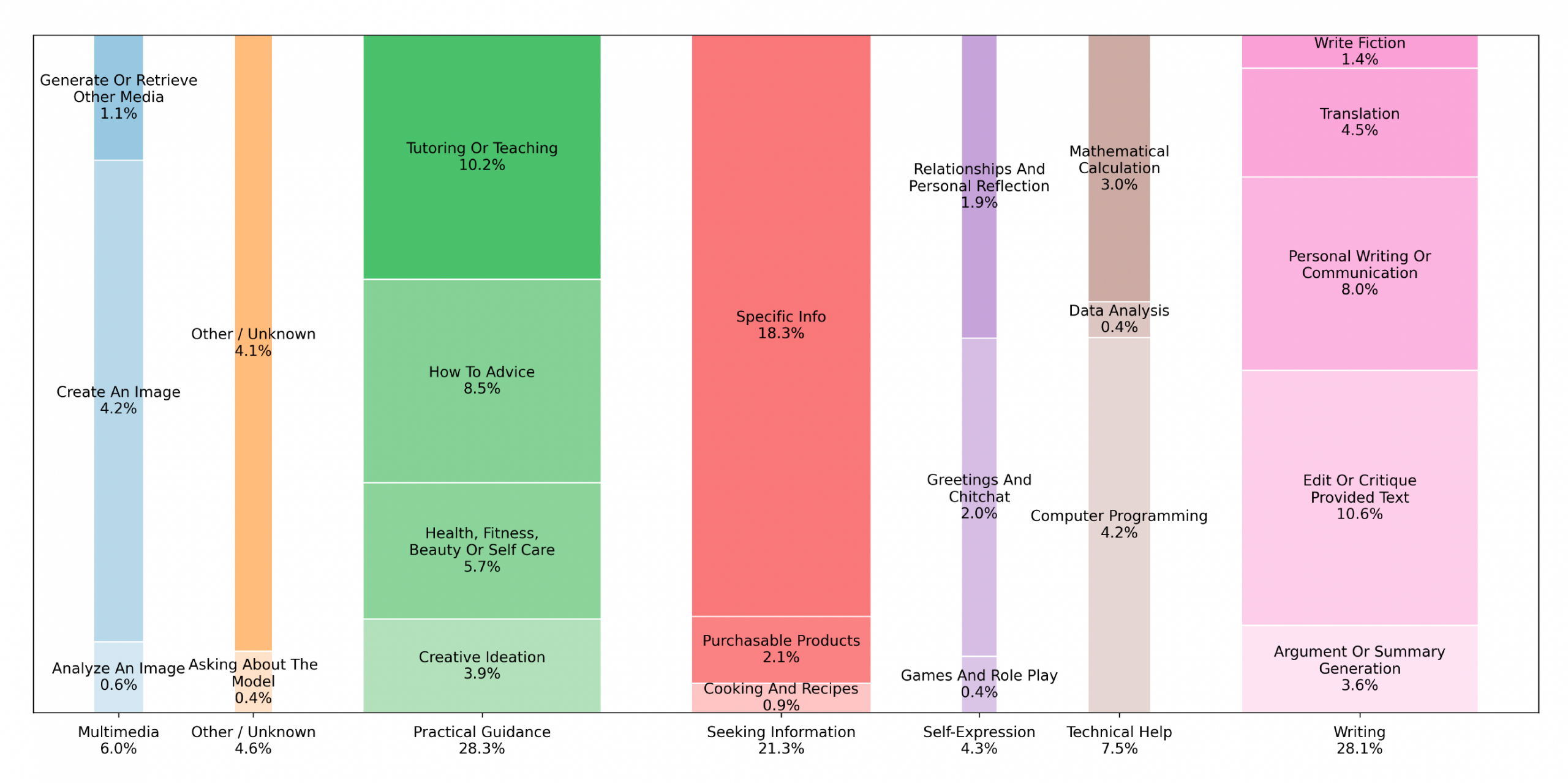
The width of the columns represents the cumulative proportion of the main category, and the height of each sub-category represents the proportion of the sub-category within the main category.
The first problem is that the percentages of the main categories do not add up to 100.
| Main Category | Percentage |
|---|---|
| Multimedia | 6.00 |
| Other / Unknown | 4.60 |
| Practical Guidance | 28.30 |
| Seeking Information | 21.30 |
| Self-Expression | 4.30 |
| Technical Help | 7.50 |
| Writing | 28.10 |
| Grand Total | 100.10 |
The percentages of the sub-categories, however, do add up to 100. Next, I measured the width of the columns to test if they actually got it right.
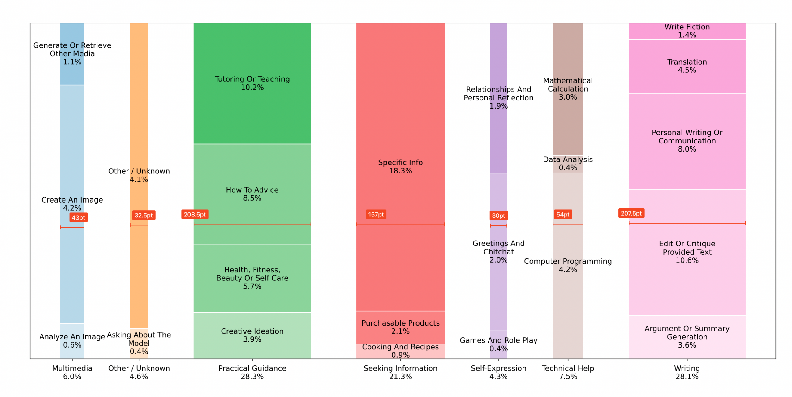
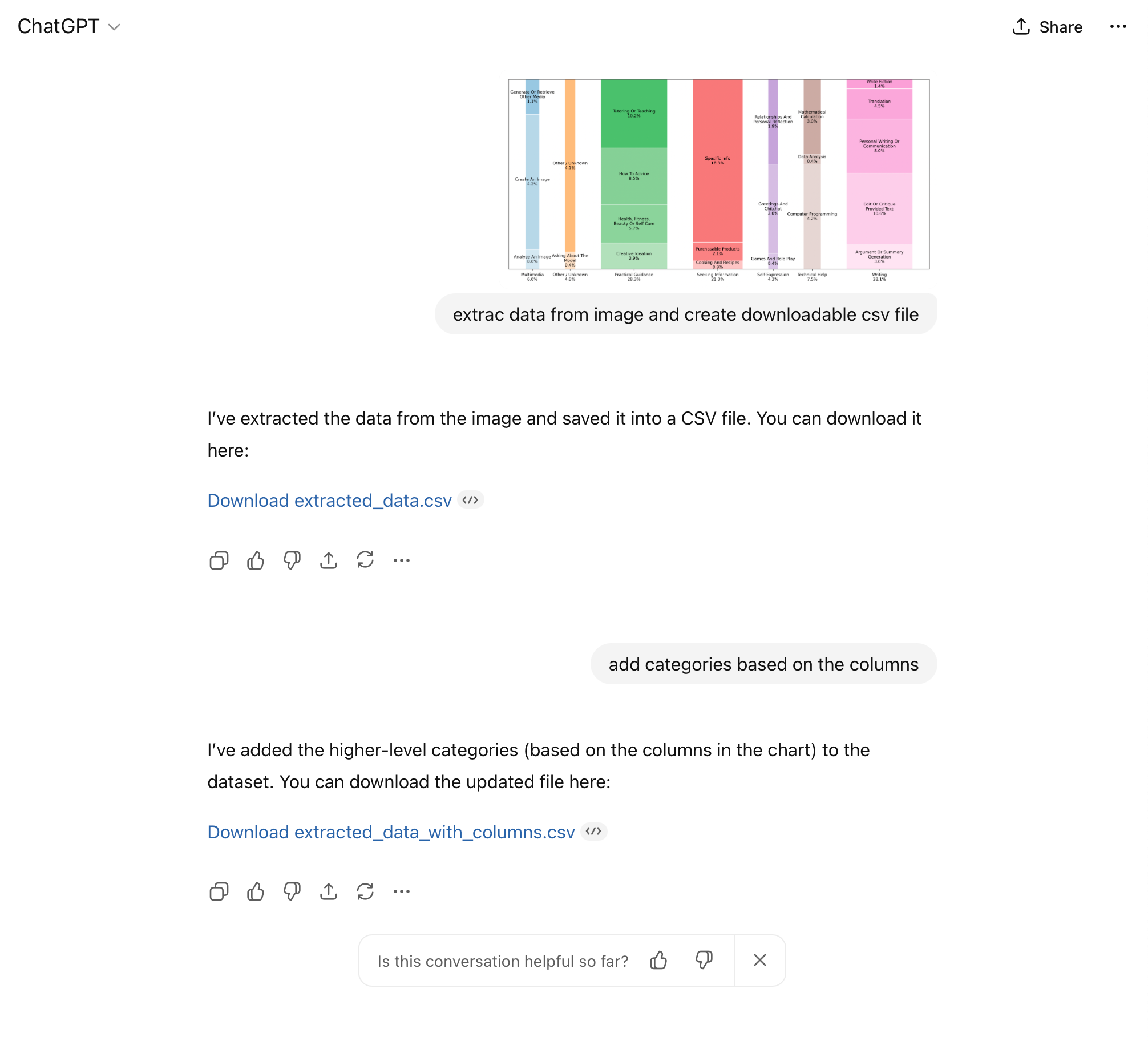
I then (ironically) used chatGPT to extract the numerical values from the graph.
Next, I divided the width of the column by the percentage it is supposed to represent.
| Main Category | Calculated Percentage | Column Width | Column Width Ratio |
|---|---|---|---|
| Multimedia | 5.9 | 43.0 | 7.3 |
| Other / Unknown | 4.5 | 32.5 | 7.2 |
| Practical Guidance | 28.3 | 208.5 | 7.4 |
| Seeking Information | 21.3 | 157.0 | 7.4 |
| Self-Expression | 4.3 | 30.0 | 7.0 |
| Technical Help | 7.6 | 54.0 | 7.1 |
| Writing | 28.1 | 207.5 | 7.4 |
While the columns approximate the main category percentages, they vary considerably. So, how can we do this better? The answer is a good old area graph. It scales each box according the the percentage and groups them into the main categories by color.
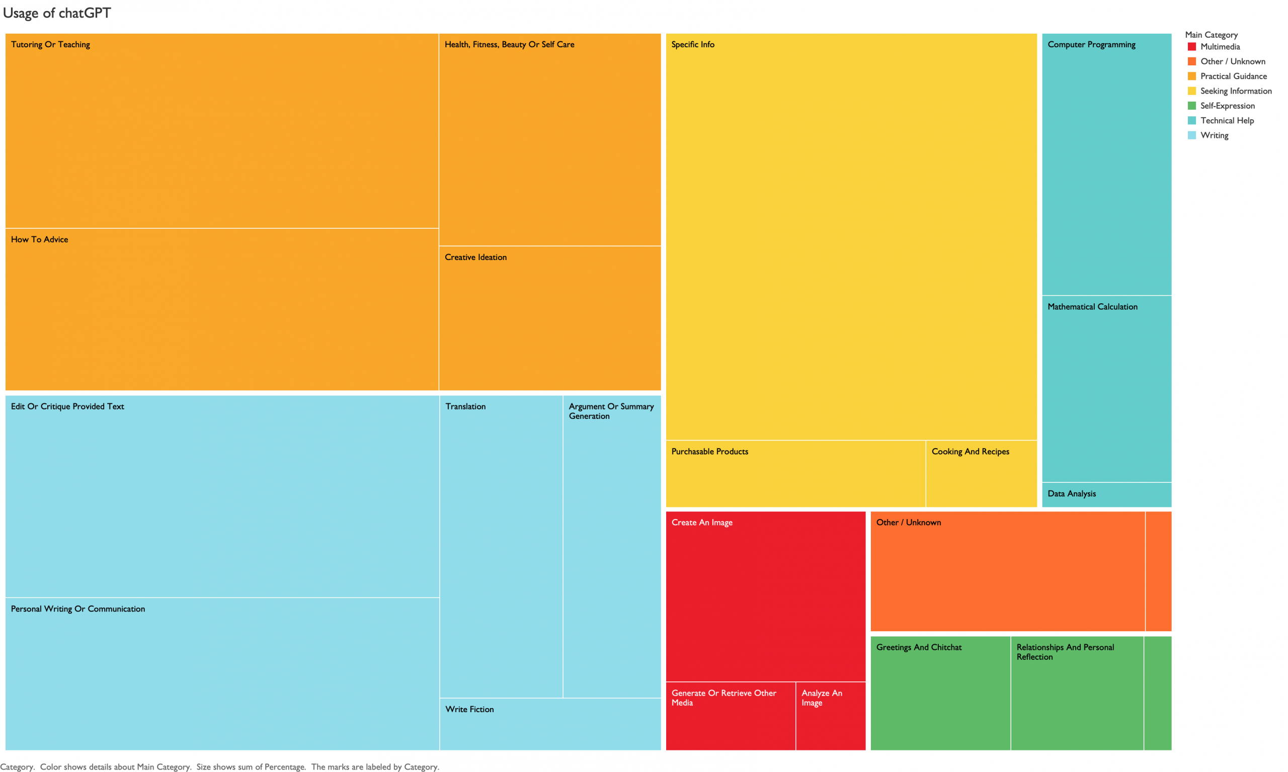
A new type of visualization is not always a better visualization.
Custom Book Casing
Today I created the custom book casings for my upcoming book “Swim Training Patterns“. Getting the settings for the laser cutter right was pretty difficult. You want clear marks on the cardboard, but you don’t want to burn all the way through. A fun little project for my upcoming Traveling Book Project.

Posters of famous computer scientists
There are many important computer scientists and innovators. I created a small and very personal list and created posters to honour their contributions.
- Ada Lovelace – First programmer
- Alan Turing – Founder of artificial intelligence
- Claude Shannon – Father of information theory
- Leslie Lamport – Creator of LaTeX
- Steve Jobs – Co-founder of Apple Computers
- Tim Berners-Lee – Inventor of the World Wide Web
Tutorial on creating patterns with Patternodes
I enjoy creating generative art with Patternodes. I created a short tutorial that shows how to program the Chains pattern shown in my last post. Once I had figured it out it was easy but the path was as usual a bit challenging.